When you sell best in class properties, are the highest grossing Kauai Realtor with over $750,000,000 sold and consecutively voted as a Top 100 Hawaii Realtor, your branding must accurately represent the quality and level of the service provided.
With combined experience of 40 years in real estate, Hannah and Peter Sirois of Kaua'i Heritage Properties (KHP) are the highest grossing realtor team on Kaua'i backed by more than $750 million dollars in sales. With the inventory dwindling on the Garden Island, KHP recognized the need to reposition themselves in the market and among their competitors to meet the expectations of today's luxury Buyer.
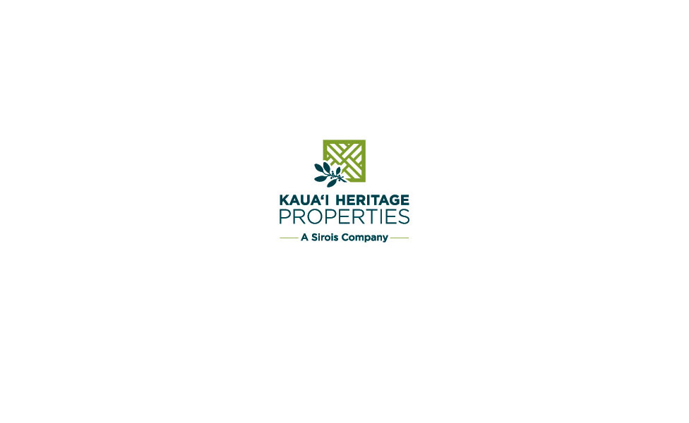
In Spring 2013, Eleven Past Studios conducted a comprehensive brand audit of KHP's previous logo, identity, website, collateral and supporting communication materials. During this period, we identified several discrepancies in KHP's brand that did not align with the high quality and level of service KHP is known for. We discovered KHP's then-logo did not meet standard best practices in color treatments, lockups and multiple usage formats from print to web. Their "mark" was reminiscent of a cartoon-like home, far from the $1M+ properties KHP continuously represents. In addition, their supporting collateral and website presence did not aesthetically communicate high-end to a high-end audience, nor was the content updated in a timely manner to deliver fresh and relevant information to an audience hungry for market data.
Once the initial evaluation was completed, we moved into a brand-kick off phase to align with KHP's vision and goals in moving forward. KHP's target audience, demographic and psychographics, competitive set, key messaging, and differentiating factors were identified. With research in hand, our team proposed a brand refresh starting with a completely new logo and identity that aligns with the quality and level of service provided.
Our 16-week branding process consisted of competitive research, concepting, primary and secondary color/font studies and deployment across offline and online materials. Within this phase, we explored several potential approaches to communicate KHP's story at-a-glance. For KHP, the word "heritage" represents their commitment to helping Buyers purchase homes that will in turn be passed on to their children in a setting that's uniquely Kaua'i and authentic to its surroundings. We ensured that each concept stayed true to this and would resonate with the audiences identified in the brand kickoff.
While many real estate companies rely on the traditional use of a home within their logo, we considered the elements of a home rather than the home itself, followed by its surroundings, and finally, icons specific to the island of Kaua'i. We narrowed the concept down to the use of a simplified plantation-style rail pattern as the main element (a commonality in Kaua'i home architecture) and paired it with a single mokihana leaf (the island's official lei) for an understated elegance rooted in island heritage. We selected a timeless sans serif typeface and placed emphasis on the word "properties" to reiterate KHP's market category and introduced a fresh color palette of earthy green with mustard undertones complemented by a teal partnering.
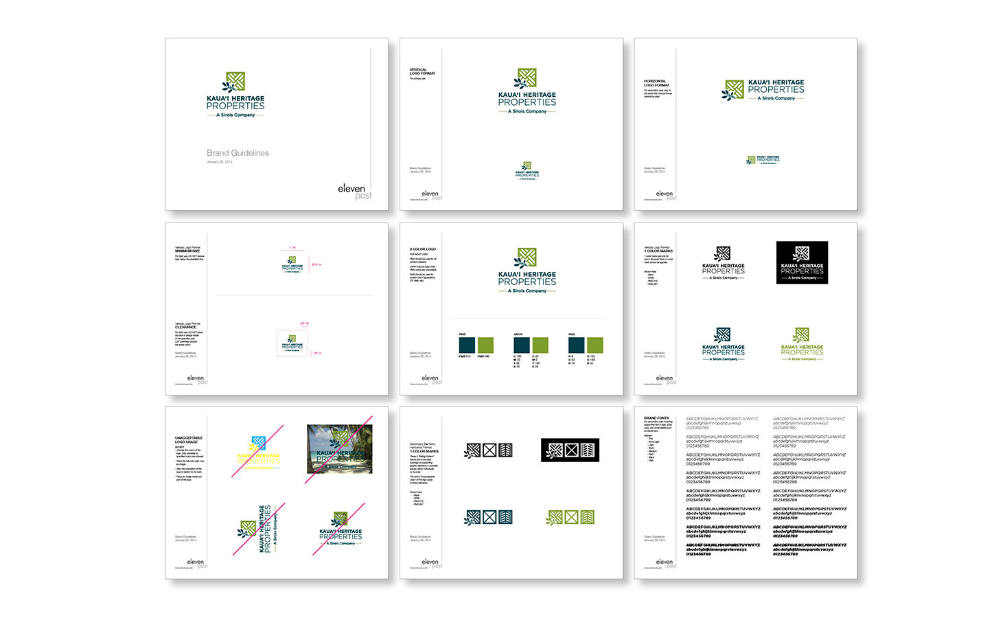
The mark was then treated for both print and web use, horizontal and vertical use, color and BW use. Brand guidelines were created identifying appropriate usage, margins, color breakdowns and typeface specifications.
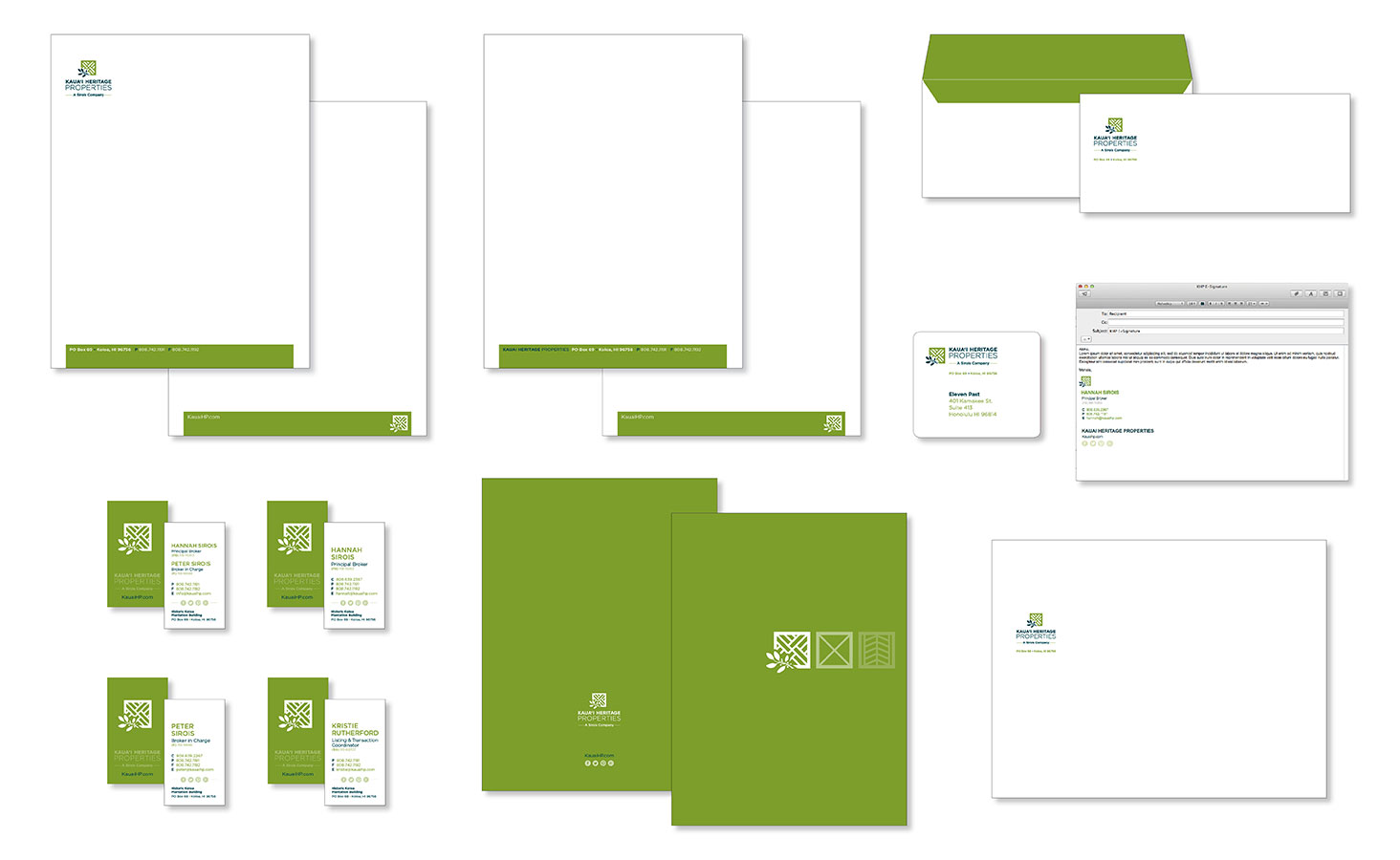
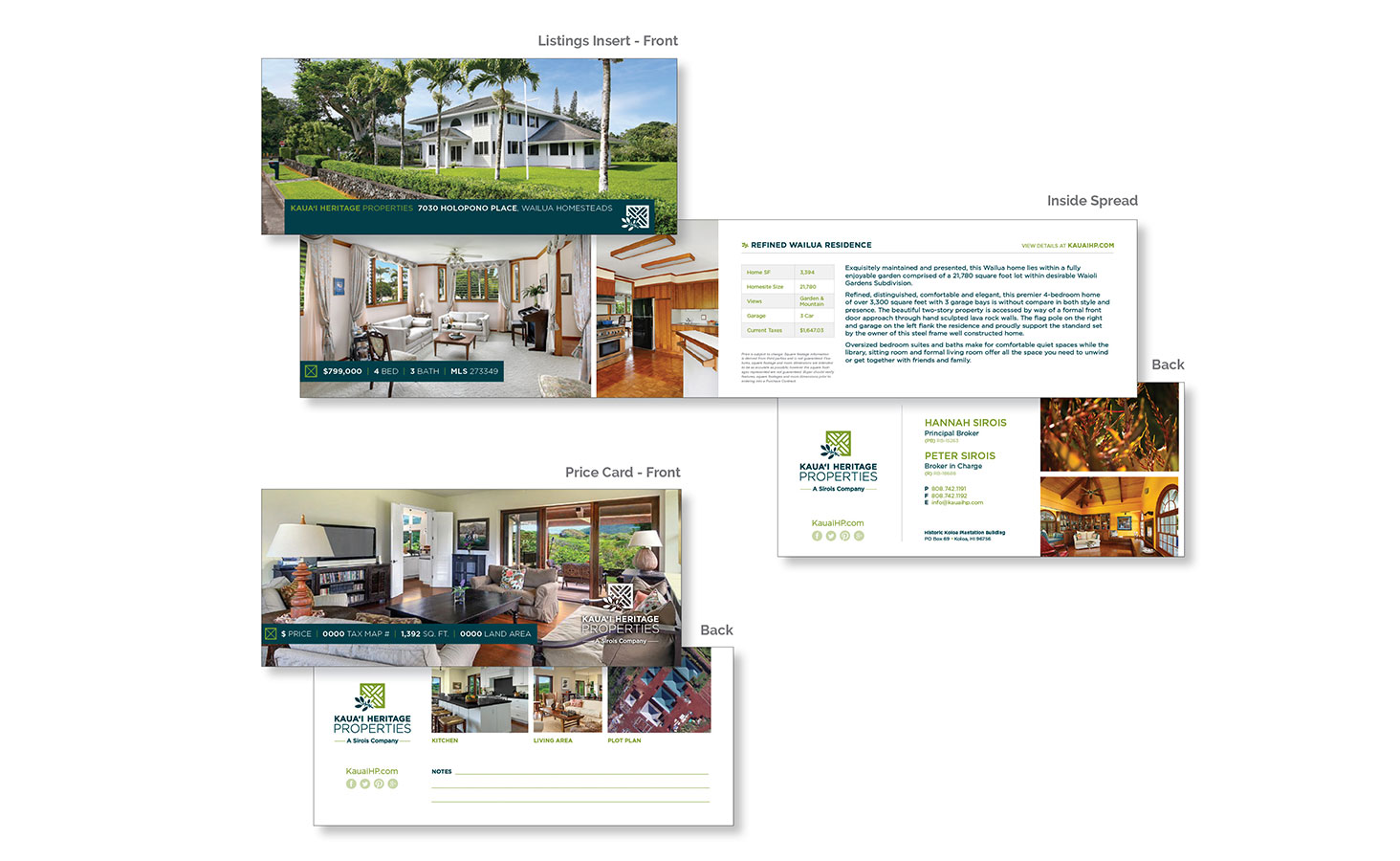
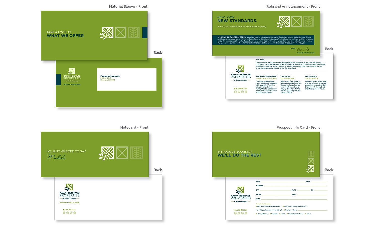
Once new guidelines were set, all supporting collateral materials, signage and online initiatives required an overhaul. We identified the individual pieces most used by KHP in their efforts to secure leads (as outlined in deliverables below) and applied the approved brand elements throughout each item for an upscale, consistent look and feel. The collateral system was based on an uncommon horizontal format designed to meet USPS standards while standing out visually from traditional real estate materials.
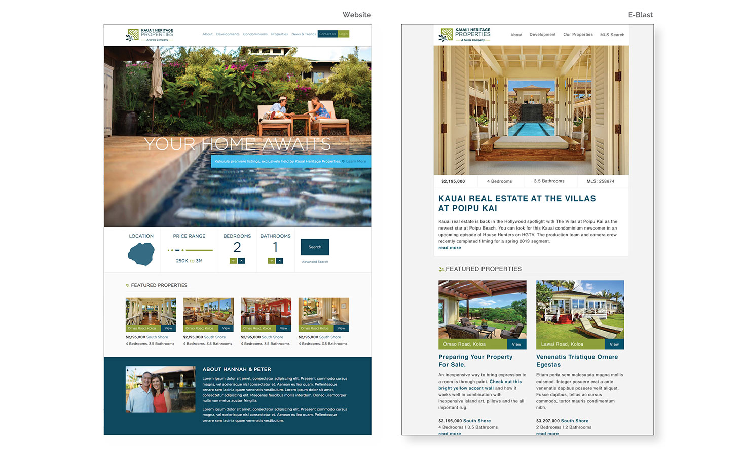
While the collateral materials received a facelift, our team worked diligently on custom building, designing and developing the new KHP website targeted to their core audiences. We researched national real estate competitors, noting cues from their functionality, presentation and content, while incorporating custom elements specific to KHP's needs. During this 9-month project, we deployed four phases from sitemap and wireframes to design and development. The new and intuitive site offers a responsive layout, in-depth search functionality tied to Hawai'i's MLS, property pages designed to mimic an in-person tour and beautifully presented and organized content for ease of navigation. E-blast and supporting digital materials were also revamped to reflect the new brand elements.
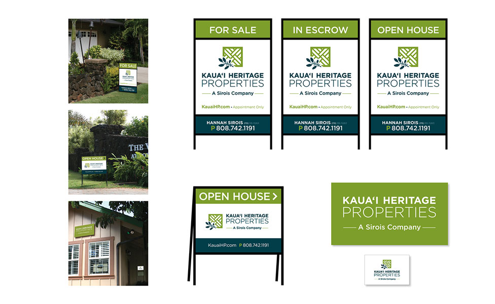
Lastly, the exterior building and general signage included office signs and In Escrow, For Sale and Open House displays with name riders. To ensure the signs would be legible to passing vehicles, the designs were simplified to include all mandatory elements and clear calls to action without appearing cluttered.
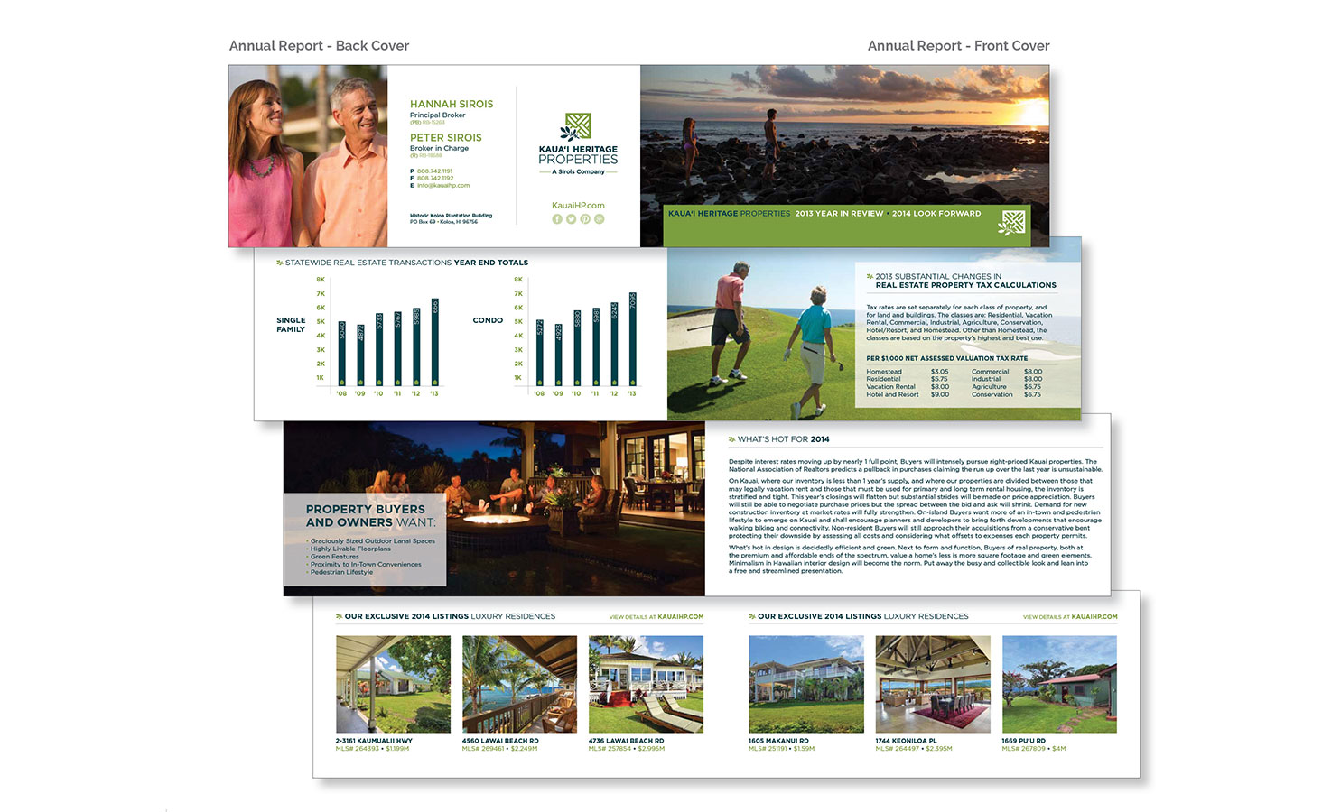
Eleven Past Studios planned the strategic rollout of the new brand, beginning with an announcement to be included in KHP's 2013 Annual Report, driving users to the new KauaiHP.com site and encouraging signups for timely data.
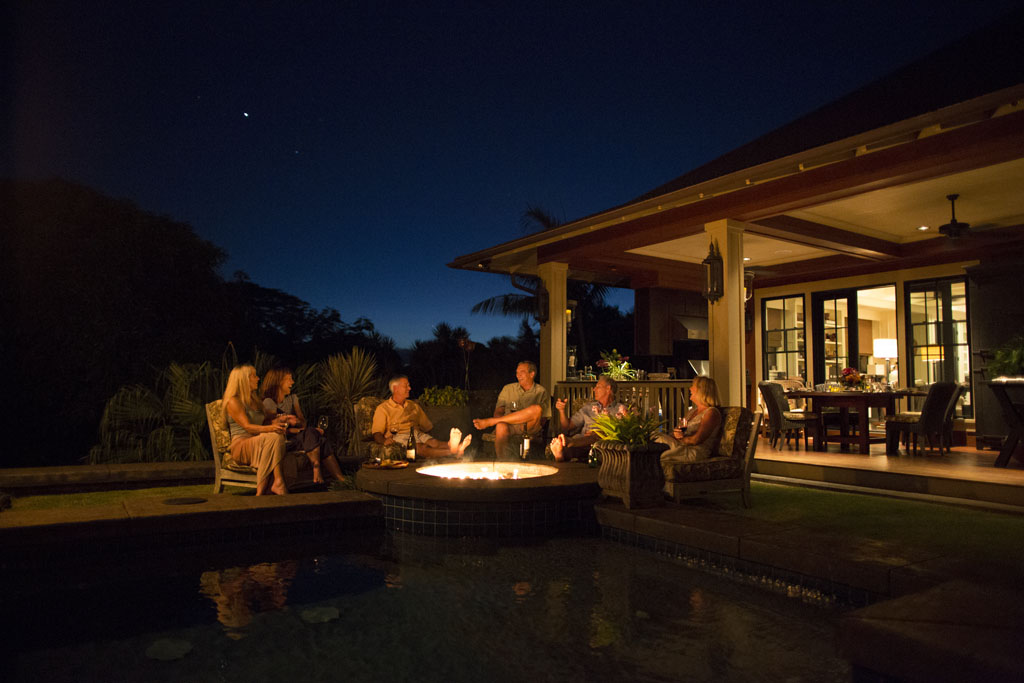
Photography + Letterhead and Second Sheets + Envelope + Business Cards + E-Signatures + Notecard + Mailing Labels + Folder and Folder Envelope + Rebrand Announcement + Material Sleeve + Annual Report + Prospect Info Card + Listing & Price Card Inserts + Property Flyers + Exterior Building Signage + Real Estate Signage + Website + E-Blast + Social Media


