Formerly known as Aloha Island Lei & Floral (AILF), this locally owned and operated lei wholesaler company was established in 2003 and initially served customers via storefront in Aiea. In 2010, owner David Paik saw a need to move sales from offline to online and enhance the overall customer experience as their immediate competitors dominated the digital realm. The company struggled with its name when compared against competitors, a weak online presence and lack of recognition by consumers although highly respected among B2B audiences. For the next three years, the company would embark on a name modification, logo refresh and the third and final iteration of their website.
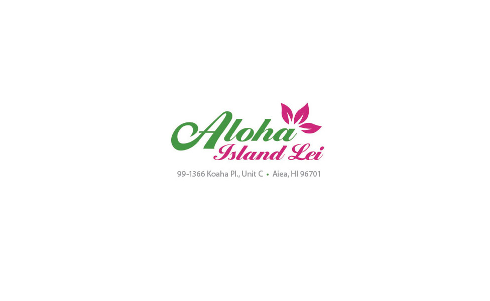
Eleven Past Studios recommended a name modification in 2010: dropping "floral" altogether and shortening their company name to Aloha Island Lei - thereby offering ease of search online and an easy and memorable name – the only name touting "Aloha." With this change came a new logo featuring a script font reminiscent of old Hawaii welcome signs combined with lei petals. A positioning statement was also developed to differentiate Aloha Island Lei from others: Providing the highest quality leis at the most value with exceptional service.
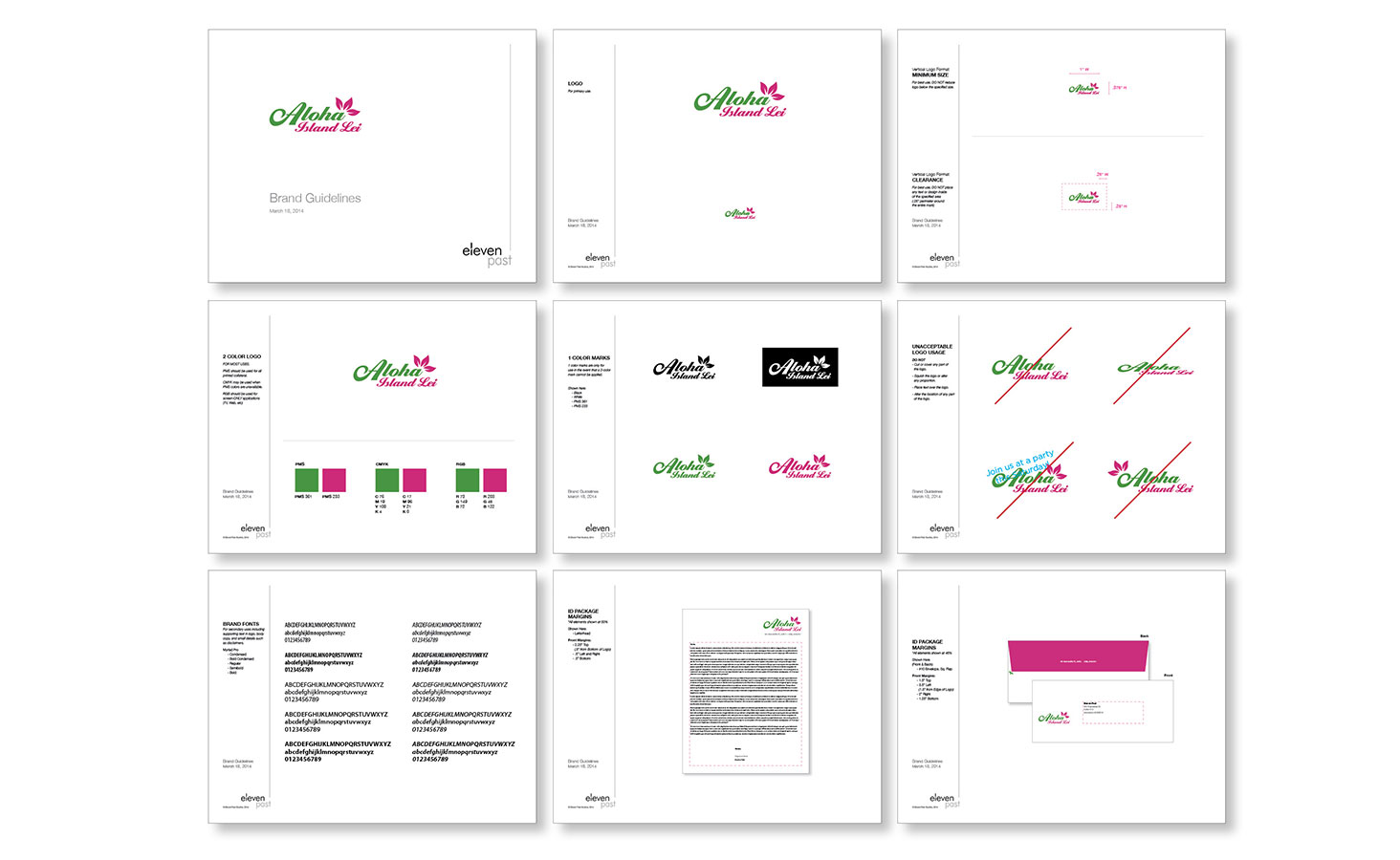
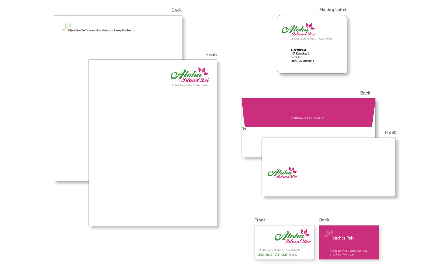
In 2013, Aloha Island Lei reconnected with Eleven Past Studios to focus energies on the "next generation" website for their e-commerce needs. However, simply designing a new website from the ground up could not happen without Aloha Island Lei re-establishing their brand and understanding their place in the current market. A brand evaluation was conducted and areas of weakness were identified for improvement, including inconsistent messaging, varying logo use, lack of branded packaging, labeling and customer confirmation (i.e. orders, forms, updates.)
Eleven Past Studios began by modifying the previous logo and reducing its palette to just the basics: rose pink and floral green, representative of their product offerings. When used against a white backdrop, the mark would remain vibrant and communicate a sense of warmth and welcome without falling into the trap of appearing dated. This new, fresh look put a modern spin on an otherwise traditional and old fashioned mark, which immediately stood out against the likes of Hawaiian Lei Company and Hawai'i Flower Lei, AIL's top two competitors. Additionally, secondary typefaces were identified for print and web use along with a color palette and brand guidelines.
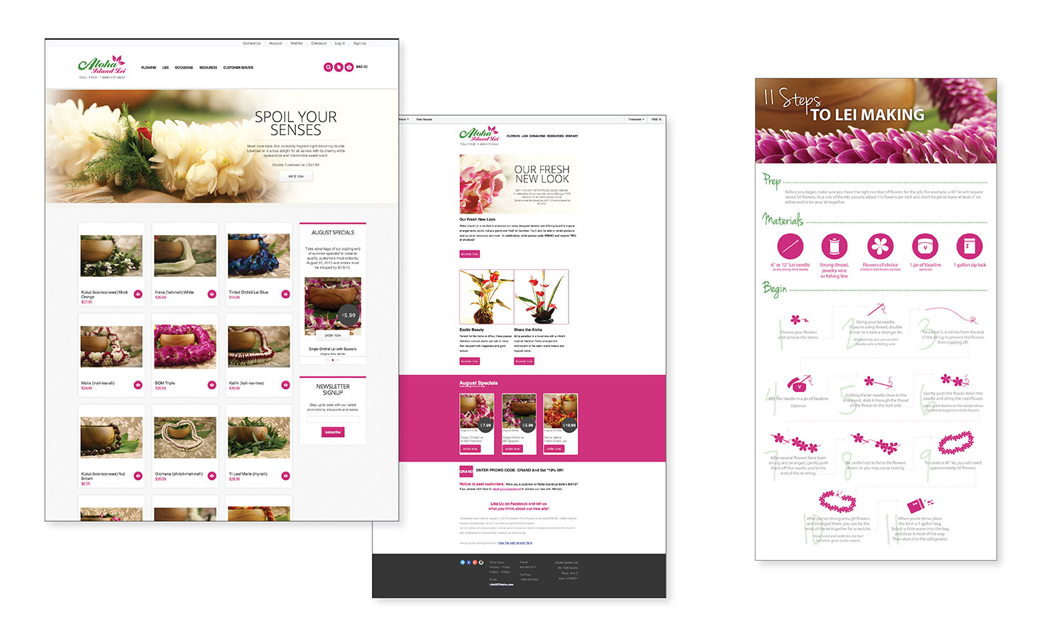
With new look in hand, Eleven Past Studios developed a new website from the ground up. New product descriptions were written to target the mainland audience, content strategy was implemented for SEO maximization, product sliders were upfront and center to promote monthly specials and in-depth search functionality by price range, occasions, and product/lei style were implemented. A CMS (content management system) was created to empower Aloha Island Lei to make their own edits and manage their customer database with ease. A matching e-blast template was also designed along with supporting landing pages for special occasion-based promotions, down to branded correspondence for order confirmations and upgrades.
Logo + Letterhead + Envelope + Business Cards + Mailing Labels + Note & Thank-You Cards + Floral Care Instructions + Guide to Lei Making + E-Signature + Website + E-Blast + Social Media


